Unifying Settings Across Enterprise Software
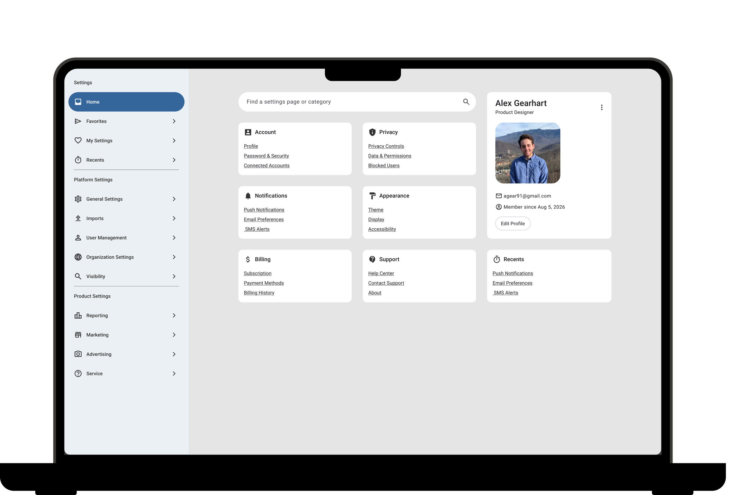
Bringing a fragmented experience to one place
Settings across four product modules had evolved independently over time, resulting in inconsistent navigation, duplicated patterns, and a frustrating experience for users. My goal was to create a unified settings experience that made configuration easier to navigate while establishing scalable patterns for future growth.
Role
Product Designer
Responsibilities
UX Research, Information Architecture, Prototyping, Developer Handoff
Team
Product, Engineering, Design Leadership, QA
Timeline
2 months
Settings Across Four Modules
“I have to jump between four different modules just to manage settings.”
Understanding why users struggled to navigate platform settings
As new features were added over time, settings were built independently across multiple modules. The result was an experience that felt disconnected and increasingly difficult to navigate.
Key Challenges
Settings spread across four separate modules
Inconsistent organization
No centralized navigation
Difficult to discover important settings
No scalable structure for future features
How might we
How might we bring together settings from four separate modules and improve organization?
Defining Structure Before Design
Using research and information architecture to simplify complexity
Rather than immediately redesigning the interface, I focused on organizing the information itself.
I evaluated enterprise platforms to understand how complex products organize large settings ecosystems and identified patterns that supported both discoverability and scalability.
Working closely with Product, we grouped related settings into logical categories and defined a new information architecture that could grow with the platform.
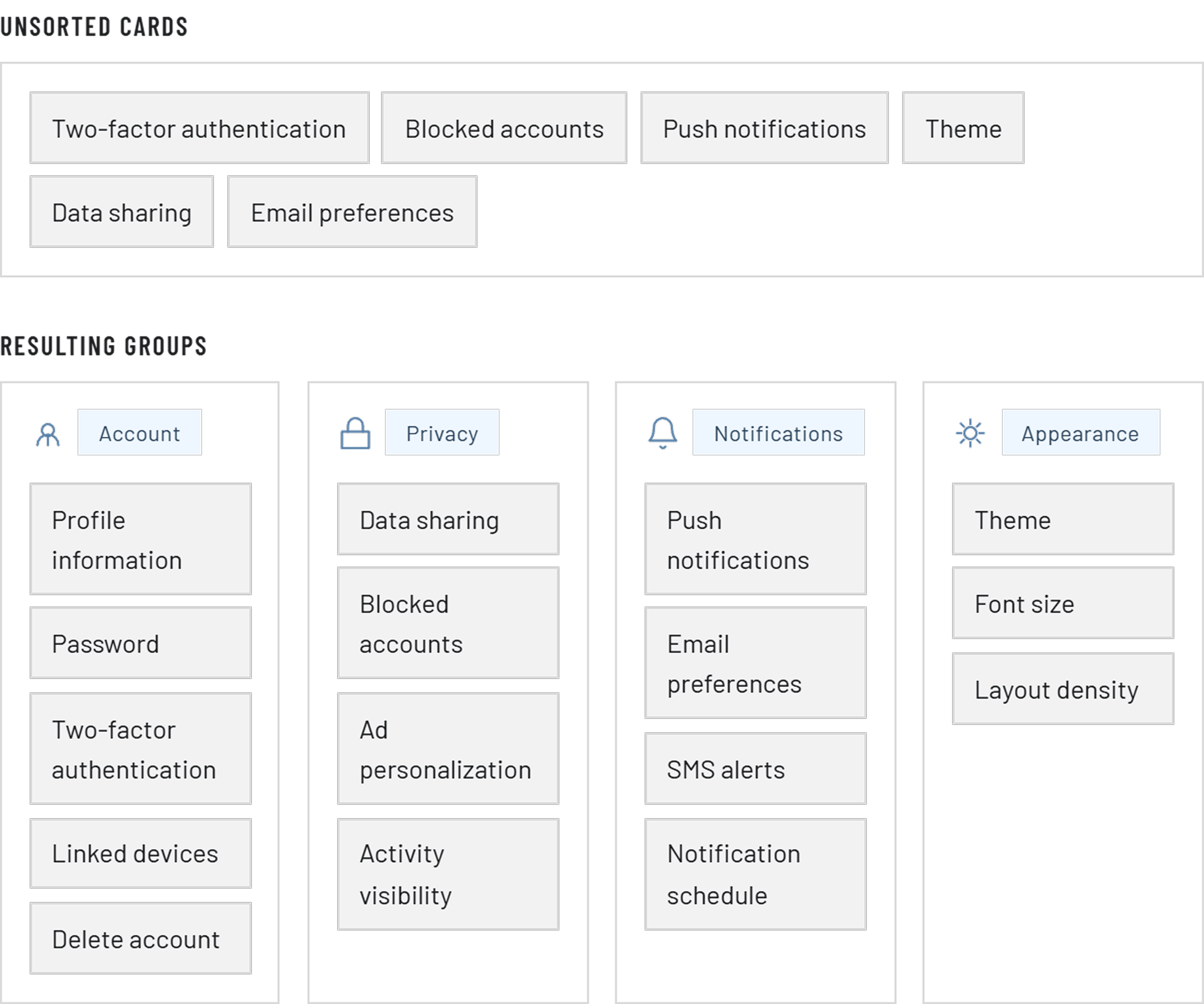
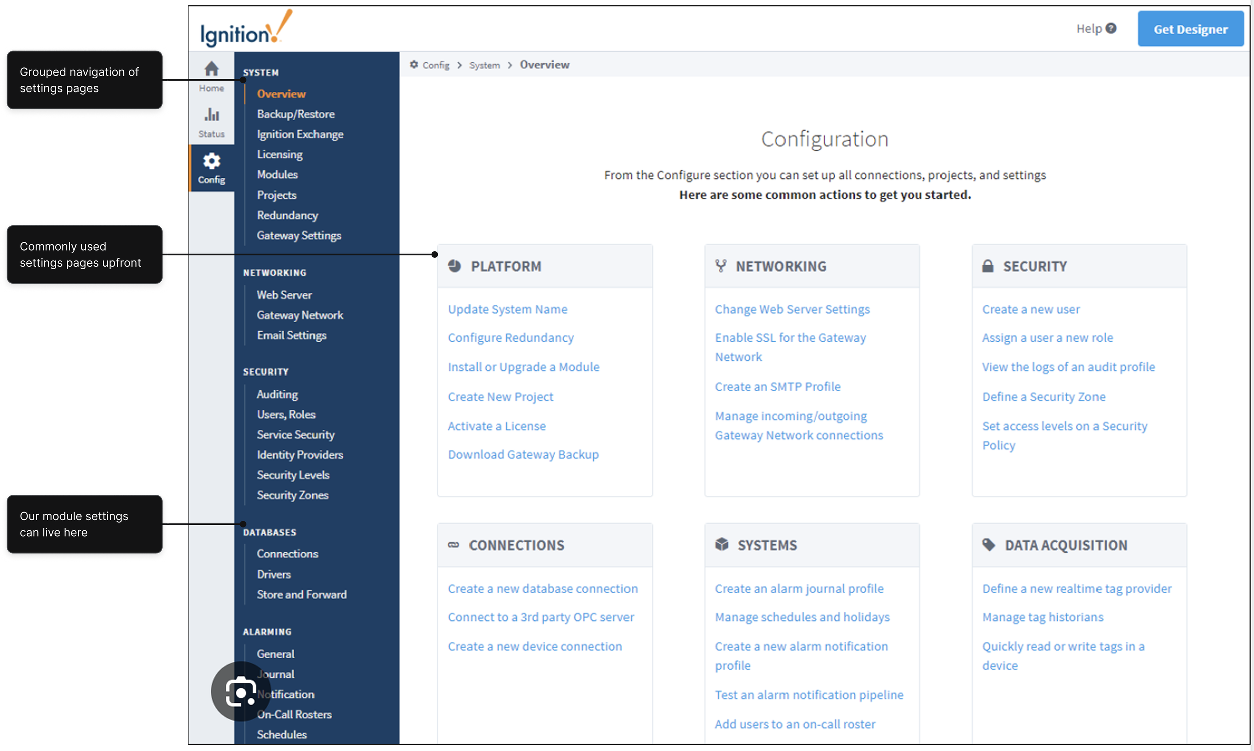
Research Highlights
Competitive analysis of enterprise SaaS platforms
Existing user navigation patterns
Frequently accessed settings
Future scalability considerations
Creating a Home for Every Setting
Designing a unified experience without disrupting existing workflows
The challenge wasn't simply combining pages, it was helping users transition to a new experience while preserving familiar workflows.
This approach introduced a modern navigation system while minimizing disruption for existing users.
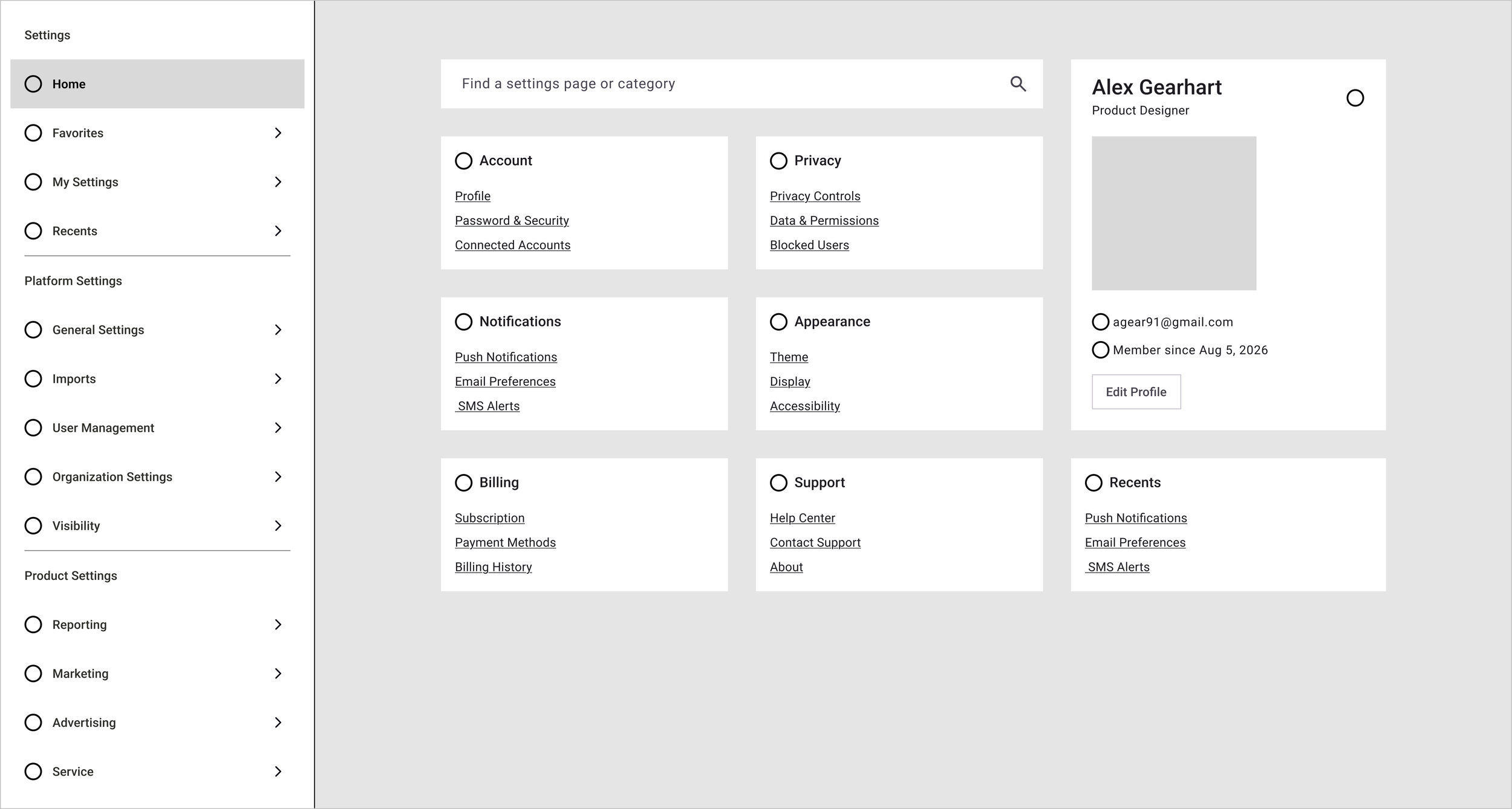
The Solution Included
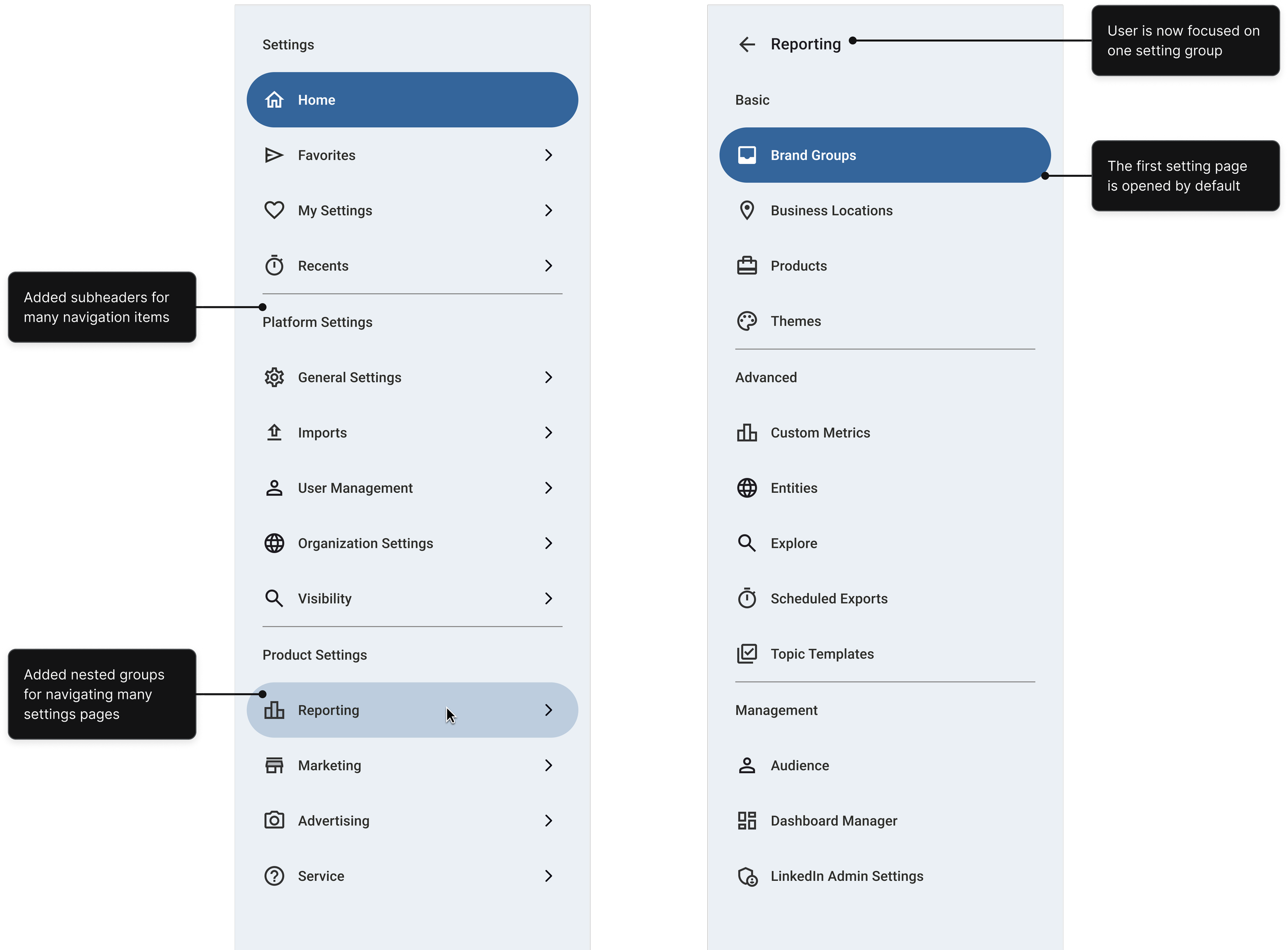
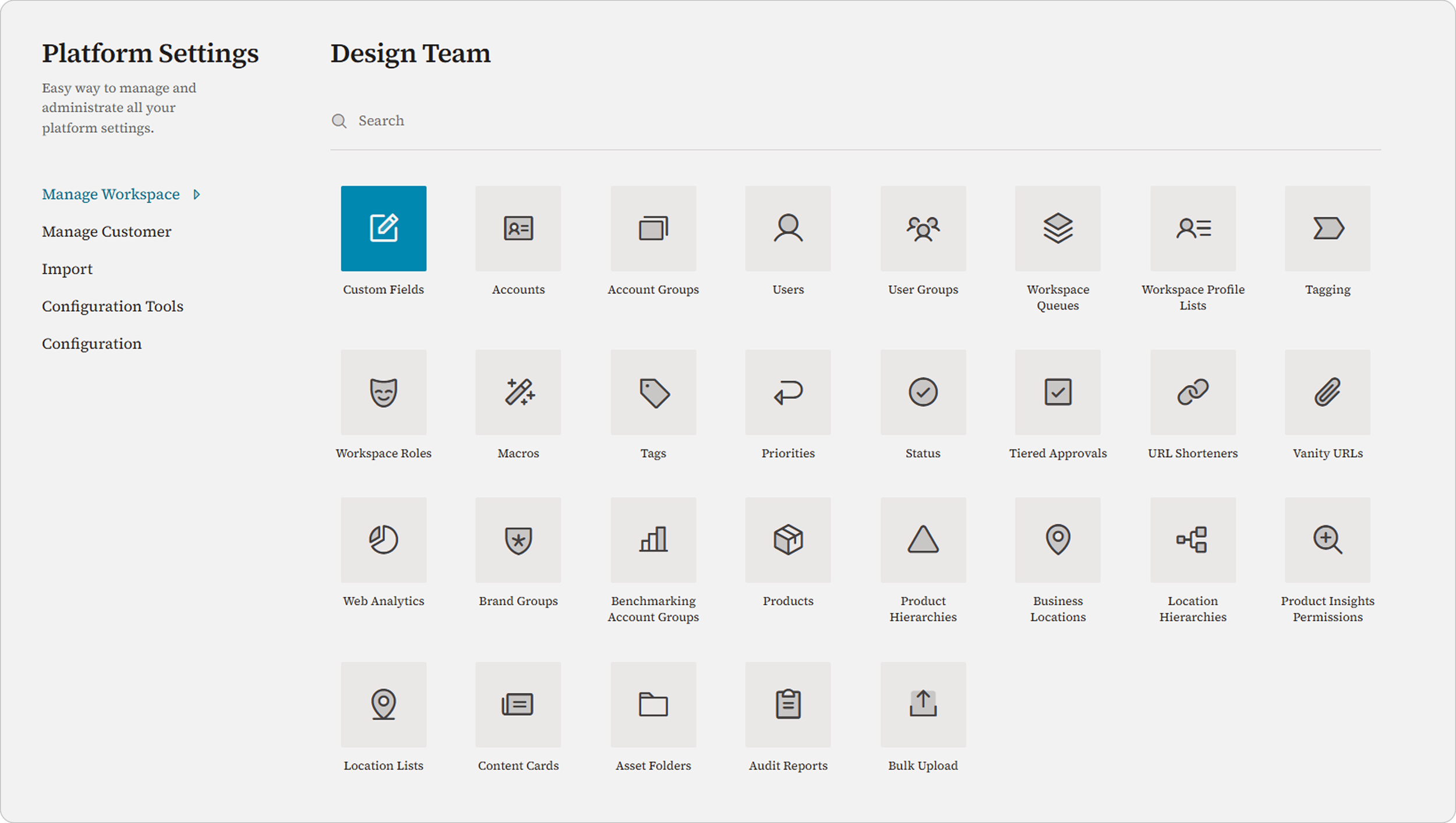
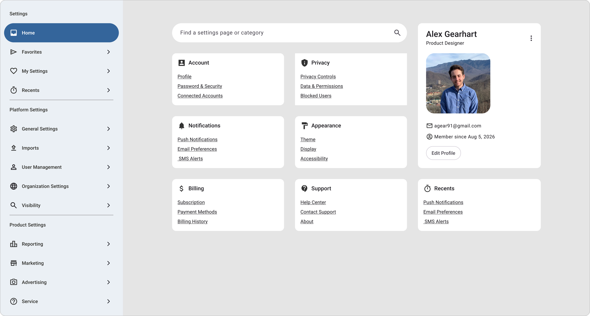
A centralized settings landing page
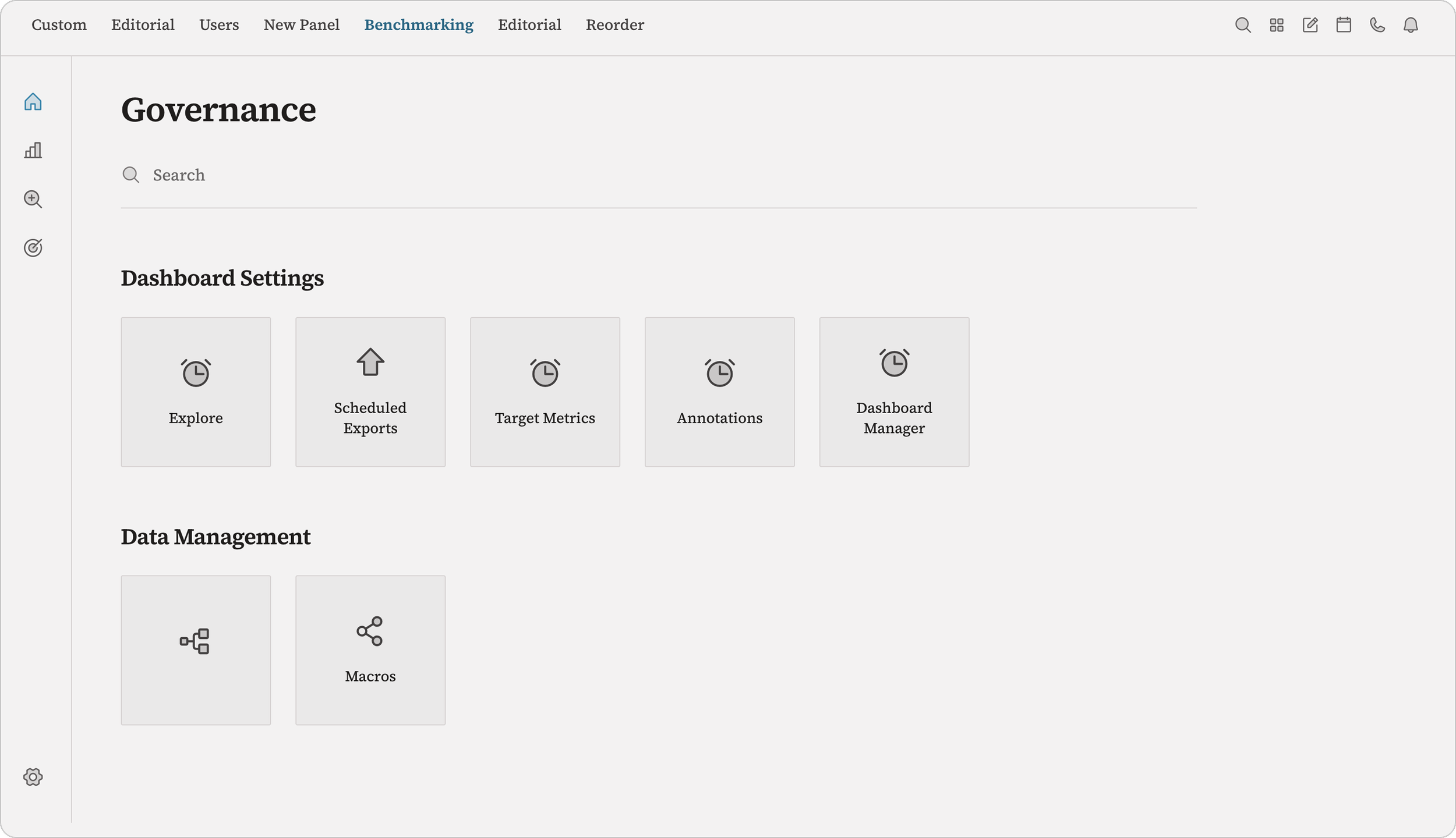
Module-specific sections grouped logically
Organized left nav
Frequently used settings surfaced first
Direct access to existing settings pages
Evolving the Design System Along the Way
Collaborating across teams to create scalable navigation patterns
As the experience matured, I worked closely with Design Leadership to iterate on multiple concepts before arriving at the final solution.
While leveraging our existing design system, I also introduced a new navigation pattern using nested groups in the left navigation, creating a scalable framework for future settings.
Throughout development, I partnered with Engineering to refine interactions, answer implementation questions, and ensure the final experience matched the intended design.
Before
Platform Settings, User Settings, and a settings page for each of the four modules
After
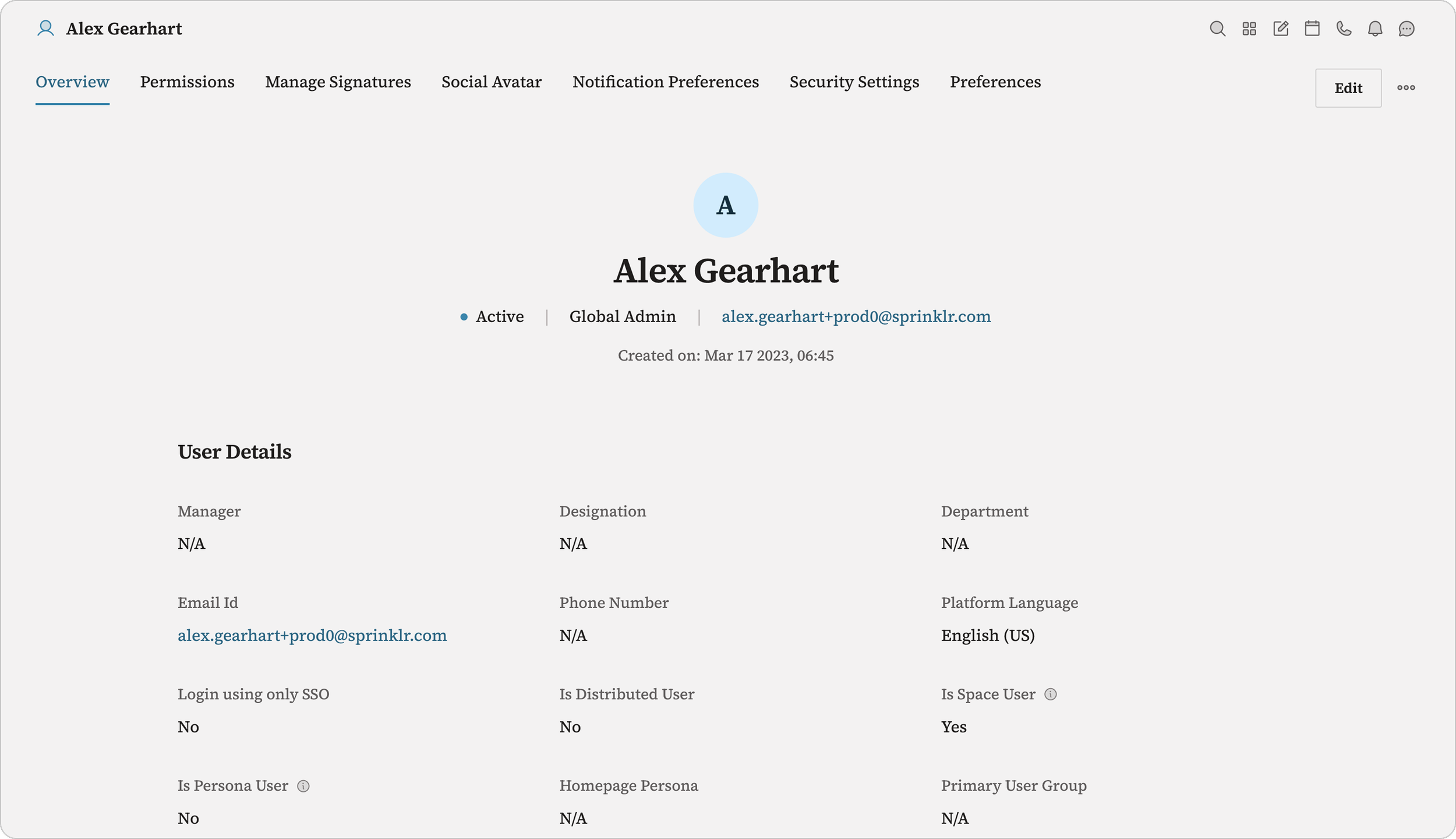
A unified settings experience
A Foundation That Scales
The redesigned settings experience unified one of the platform's most fragmented workflows and established a scalable foundation for future product growth.
99.7% retention on the new settings experience after rollout, with only 0.3% of users choosing to switch back to the legacy version.
The Takeaway
This project reinforced that improving a platform experience starts with information architecture, not visual design. By focusing first on how users think about settings and then designing a navigation system around those mental models, we created an experience that was easier to navigate today while providing a framework that could continue to scale as the platform evolved.